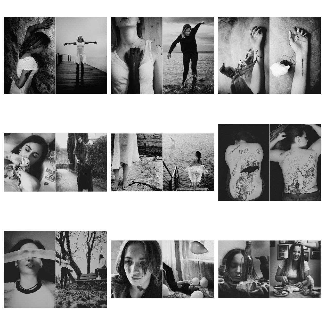
only the slightest idea
Monat: Februar 2021
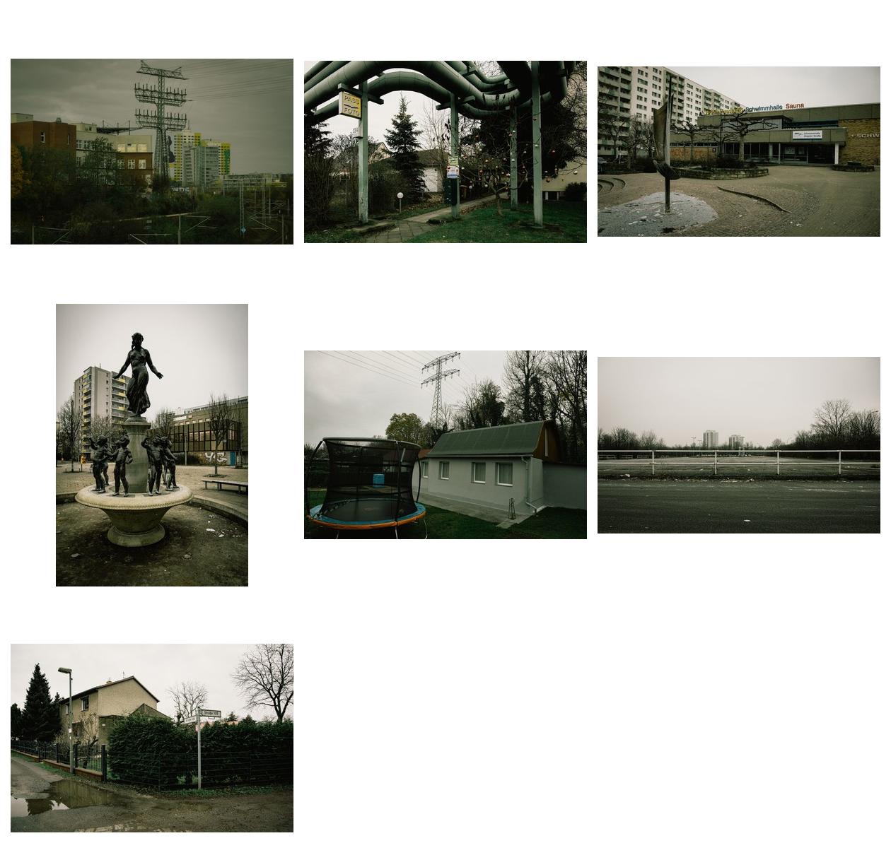
Urbane Ansichten: Berlin Lichtenberg
Die dunklen Tage
once upon a time
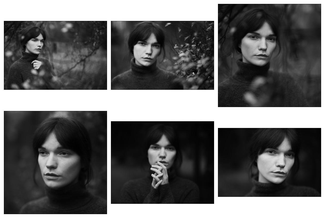
Classic portrait
Projekt,Depression -Heilung
Black and White vs Color photography
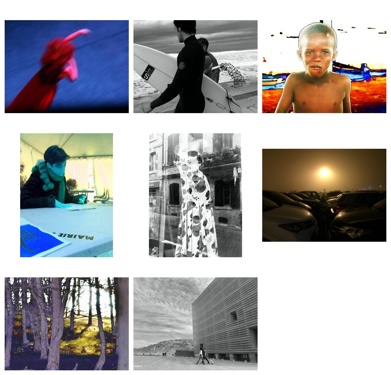
I do love black&white photography and some people told me that I was used to do b&w with color photography. I didn’t understand at first and I don’t know if they are true. But that made me think about it.
It is true that the composition, the lines, in other words, the structure, is what strikes me most in a picture.
I went back to some of my images, and indeed I have often used false colors or striking ones like in this first picture of dance, with the contrasting red and blue. Obviously, contrast is a way to get highly structured pictures in b&w photography, like in the surfers‘ one with that heavy black suit in the front and middle of the picture. But I achieved a detached effect of the young boy in color with depth of field and the contrast between the rough colors behind and the unity of his skin.
The "sang bleu" (blue blood) picture (which is a french joke about noble people’s blood, as I took this picture during a "give your blood" session) is probably mostly a b&w type photography. Well I do love the blue atmosphere and the blue square in the front, but it is not a colorful picture indeed, yet a highly structured one. Is it what they meant when telling me I did "b&w photography in color" ?
On the other hand, I really felt like having the "flowery dress" in b&w rather than in color because it seemed to me to be more striking with the reflection of the street and the black windows behind. And can’t you see the colors of the flowers ? I remember Ansel Adams saying he achieved a far greater sense of color in black and white ! Well, I’m not sure I agree, but I do not miss the colours of these flowers.
The "car park" is probably another "almost b&w" picture. But in this one I do like the yellow sun like halo of light and I would certainly not have changed it to black and white even though its structure would have fit well. The "sous-bois"‘ is false colors. Perhaps it is not so important and could have it in b&w : the main topic is the flow of light in the opening in the distance, with the silhouettes of the trees. But I like the pale purple of the trunks in the front and the yellow-green of the grass and moss under the trees.
The last picture, the museum at sea front in San Sebastian, Spain, which I have named "passers by" is really a mere b&w picture for me. You can imagine the blue sky, ok, but I do not think it would get more interest. On the contrary colors would probably get this picture less striking with the contrasts between the building lines and the mustard sky and the people walking in the middle.
I let you appreciate these differences between b&w and color photography through these few examples and refer to your own practice. Let’s think (and talk) about it !
Philippe
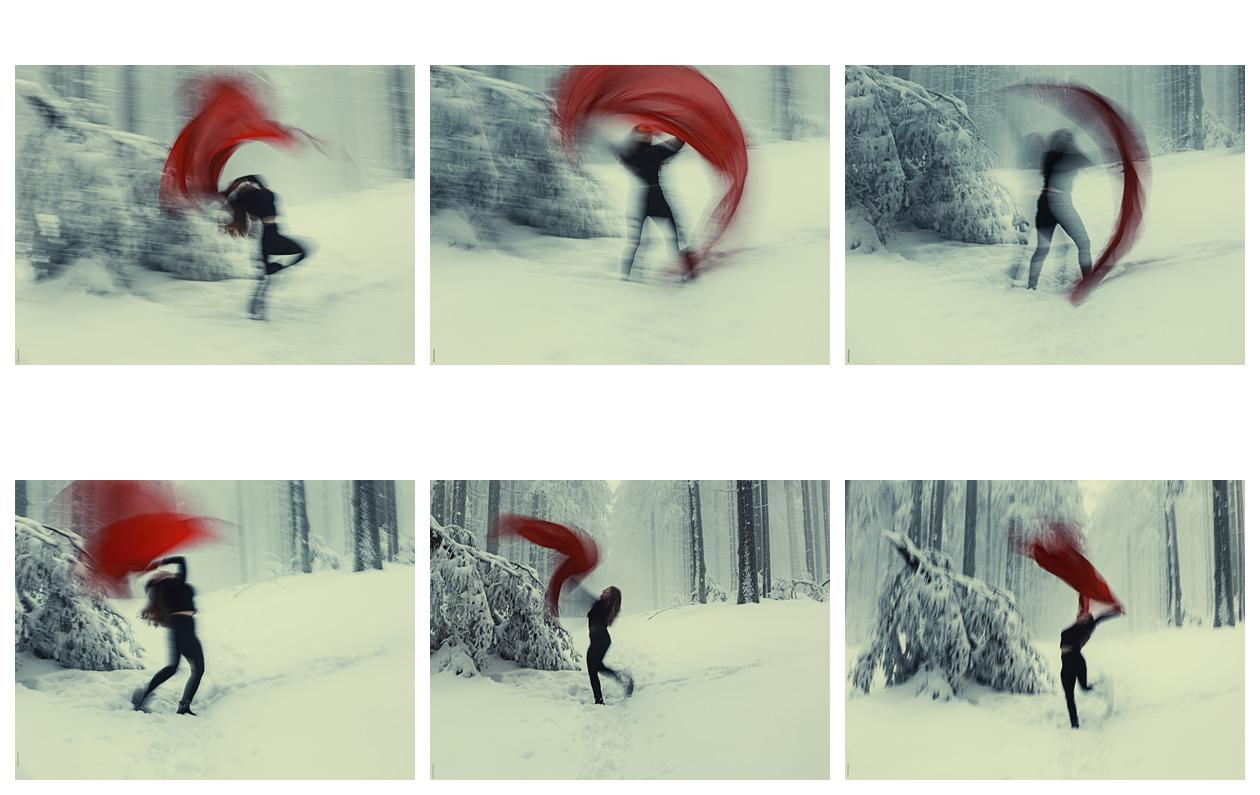
snowcorrida | 2o21
Editors‘ Selection – #49
100 striking images · 2020-01-30 – 2020-03-05
Cover: »***« | Mecuro B Cotto
Many Thanks to the contributors:
aaron walls· achim brandt· acqua&sapone· ad-photo· alexander kuzmin photography· alexandra laffitte· alexandru crisan· ana lora· ando fuchs· andrea schwelle· andreas jorns· andreas reh· anna abstraction· annuschka· astrid susanna schulz· axakadam· bcb karim· bienvenido cruz· buddabar michal· by the sea· carsten schenker· christian fuhrmann· conrad· d.hoffgaard-photography· daniel wandke· daniel.nartschick· denis peaudeau· francesco rizzato· frank bayh & steff ochs· goal74· greggory wood· gutenbild· holger nitschke· hud1ai2· igor burba· igorkostin· iso_fotografie· itsumo hima· jamal cazaré· jarek januszewski· jens krüger· kantorka· kayserlich· knas· kopfbild· leszek kowalski· lichtundnicht· lukas kaminski· marek juras· marie· marie-luise müller· mark kinrade· marseiphoto· mauro· maxime broy· mecuro b cotto· merih miran· michael hemingway· michaelmoeller· nakiesheri· oliver viaña· patricio suarez· peacocks feather· peculiar.mind· peyman naderi· philippe galanopoulos· photographer tetsuro higashi· pictory· piet.sommer· pixoom photographie· ralf tophoven· ray gray· rdpx· renate wasinger· sabine gassner· scott hargis· sergey sivushkin· sprache der seele· storiesoflightandshadows· susanne jeroma· thomas berlin· thomas freyer· thomas strauss photography· thorsten geisser emotionale fotografie· tunguska.rdm· vivienne b· werner gstrein· woman of dark desires· yulkin evgenij
Teilnehmer: Fotograf Mecuro B Cotto
