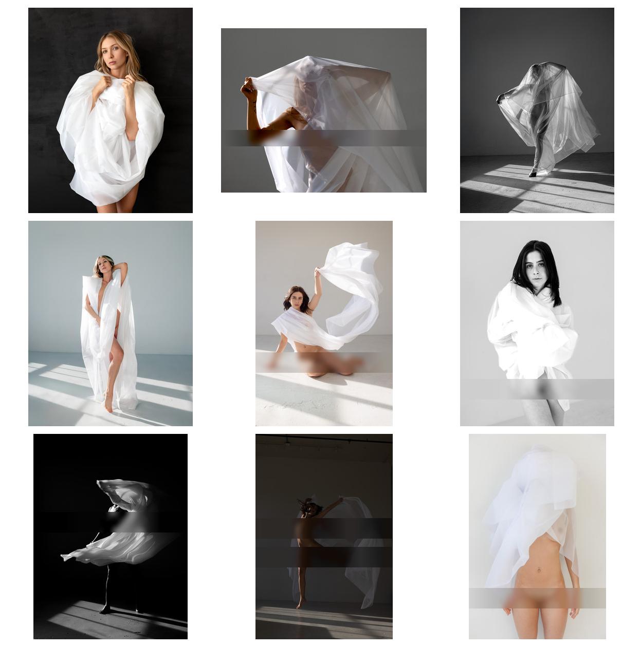
Vote for the Cover of STRKNG Editors' Selection – #82

Vote for the Cover of STRKNG Editors' Selection - #82 - Blog-Beitrag von  STRKNG / 06.06.2025 10:50

1) »Maryam« © Photographer Behnam Khorramshahi

2) »Dorsal« © Model Miss Souls with marc von martial

3) © Photographer Michael Hemingway

4) »cat part1 I/V | rue | tanzsaal | 2o24« © Photographer Willi Schwanke

5) »Emma« © Photographer Kai Mueller with Riel Life

6) © Photographer Ash Day Participants: Irina ludosanu

7) »Gemma« © Photographer Jürgen Neitsch

8) »Julia« © Photographer s_pro

9) »Posture« © Photographer Yeh Shu Yu

Use only one number in the comment.

Only one vote per person. Thank you!

Voting ends Tuesday 17th June 23:55h MET

Publication covers so far….

https://strkng.com/en/publications/

Teilnehmer: Fotograf Ash Day / Fotograf Behnam Khorramshahi / Model Irina ludosanu / Fotograf Jürgen Neitsch / Fotograf Kai Mueller / Fotograf marc von martial / Fotograf Michael Hemingway / Model Miss Souls / Fotografin Riel Life / Fotograf s_pro / Fotograf Willi Schwanke / Fotografin Yeh Shu Yu

Hinter den Spiegeln

Hinter den Spiegeln - Blog-Beitrag von Fotograf Thomas Gerwers / 04.06.2025 06:23

It’s a poor sort of memory that only works backwards

(Lewis Carroll)

Doch was, wenn alles zugleich geschieht –

Erinnerung, Spiegelbild, Verschwinden?

Ein Gesicht, halb da, halb fort,

flimmert zwischen gestern und gleich.

Der Raum atmet Stille,

der Blick sucht Halt im eigenen Schatten.

Hier ist Zeit nicht Linie,

sondern Fläche –

verwischt, gespiegelt,

offen nach innen.

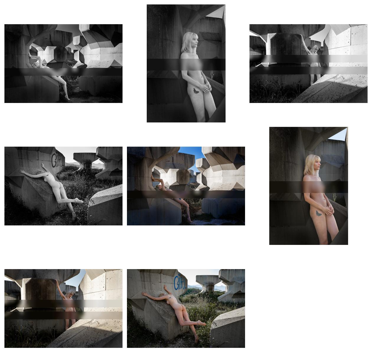
B&W vs Color – Drawing vs. Painting

B&W vs Color - Drawing vs. Painting - Blog-Beitrag von Fotograf Walter Eckardt / 01.06.2025 00:12

Current mainstream seems to prefer black & white. However the real world comes with colors. So why is black & white liked better?

The reason is probably simple: It is easier to create B&W as it is easier to digest B&W.

For photographers: B&W doesn't ask for managing colors, doesn't require respecting messages which colors automatically bring, doesn't contain color-intrinsic moods (e.g. red for love, red for aggression).

B/W focuses on a picture's structures but subordinates the message of the scene.

Color does similarly – just the other way round.

For viewers: It's ways easier to detect the structures, the geometry of a picture by not being distracted by additional information coming from colors or the scene. B&W is much easier digested. It's fine for the quick glance, but it runs the risk for becoming boring when being watched intensively.

This series of pictures tries to show the B&W baseline (drawing) which makes the foundation for the final picture (painting).

Choose by yourself.