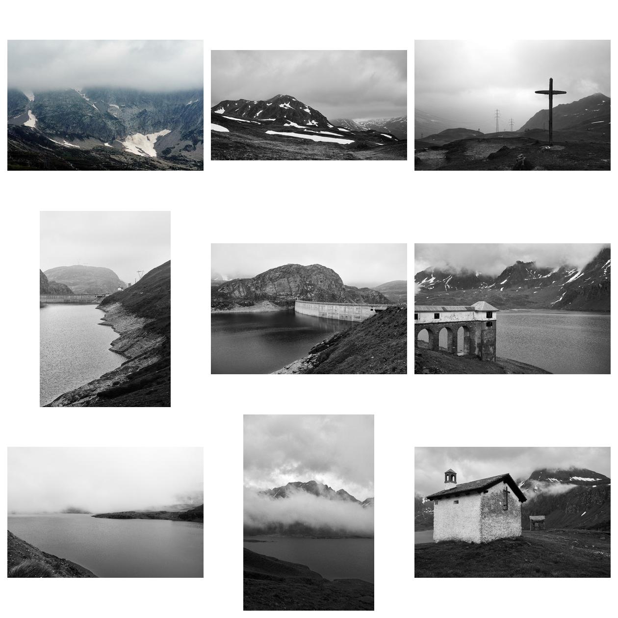
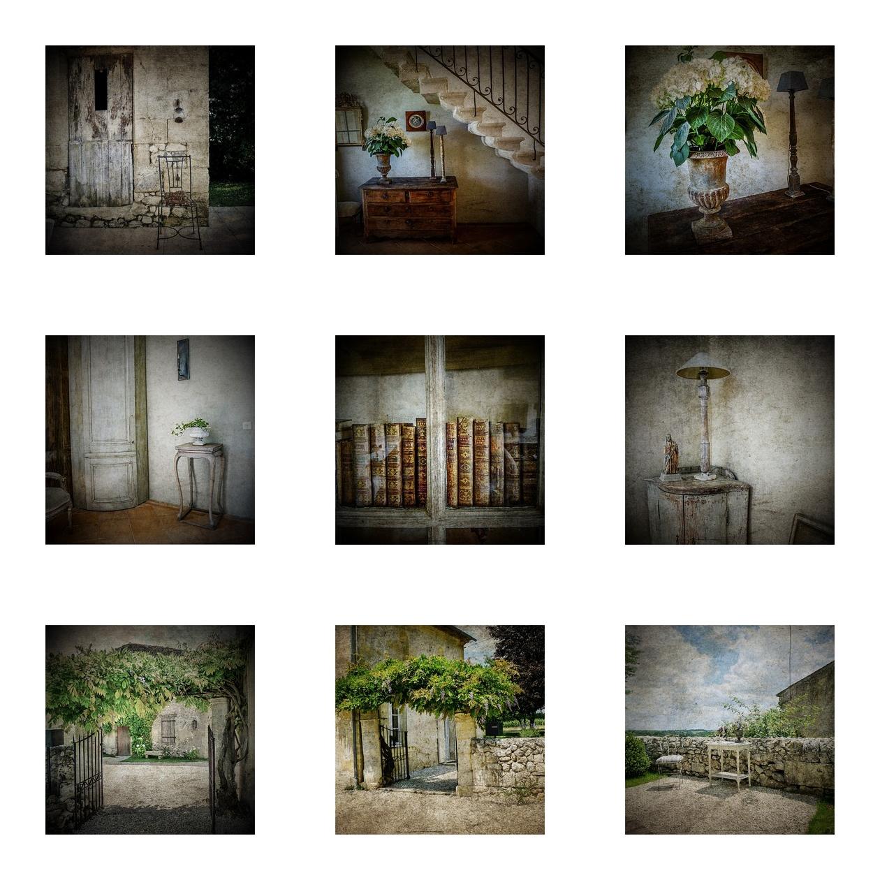
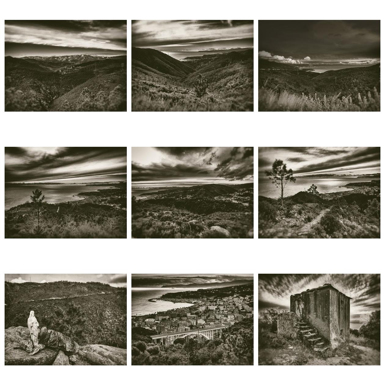
leichter Niesel, die Wolken hängen tief. ich erinnere mich gern in schwarzweiß an den Tag.
Kategorie: Landscapes
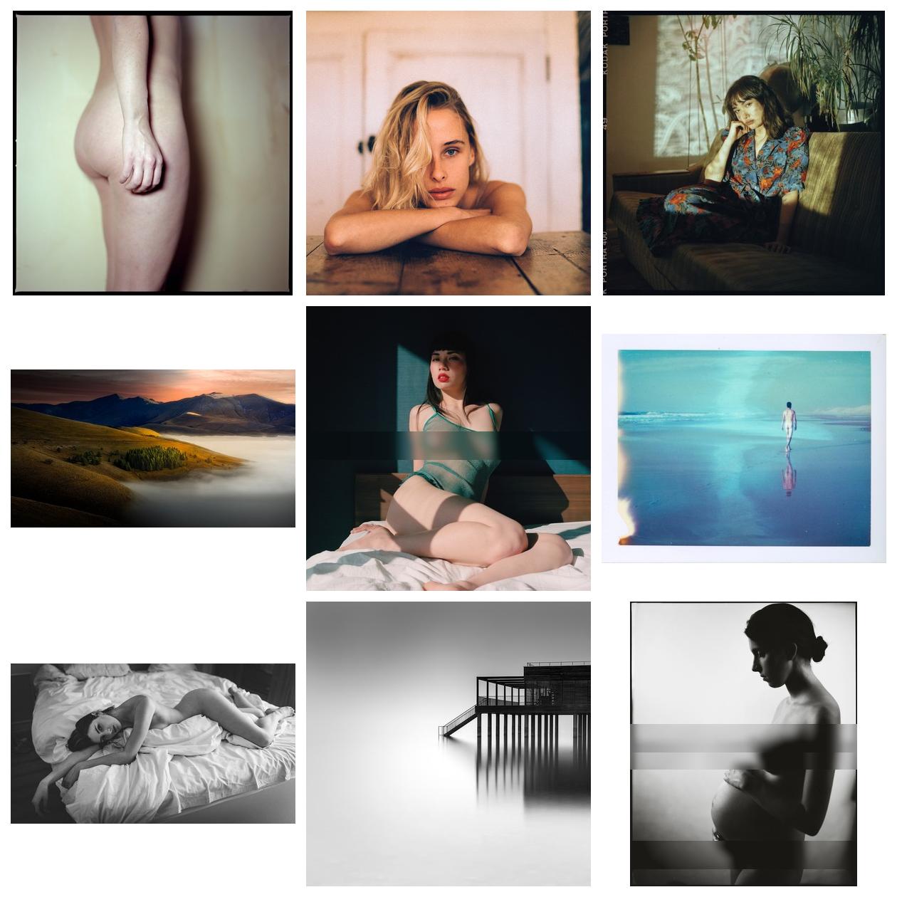
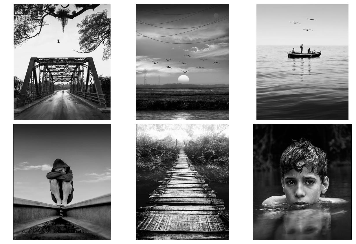
Vote for the Cover of STRKNG Editors‘ Selection – #53
1) © Photographer Laurent Askienaz
2) © Photographer Alberto Monteraz
3) »asap« © Photographer Zwischensequenz
4) »Golden hills« © Photographer Fabrizio Massetti
5) »timelessness unfold« © Photographer Praise of light
6) »With himself« © Photographer Lili Cranberrie
7) »A*« © Photographer Maxime Broy
8) »Bregenz, #1« © Photographer Thomas Bichler
9) »Two« © Photographer Albert Finch
Please use the number in the comment.
Only one vote per person. Thank you!
Voting ends Tuesday 6th July 23:55h MET
Publication covers so far….
https://strkng.com/en/publications/
Teilnehmer: Fotograf Albert Finch / Fotograf Alberto Monteraz / Fotograf Fabrizio Massetti / Fotograf Laurent Askienazy / Fotografin Lili Cranberrie / Fotograf Praise of light / Fotograf Thomas Bichler / Fotograf Zwischensequenz
Wieder analog
#Moravian – Silesian country / Czech Republic
Home sweet home
Black and White vs Color photography
I do love black&white photography and some people told me that I was used to do b&w with color photography. I didn’t understand at first and I don’t know if they are true. But that made me think about it.
It is true that the composition, the lines, in other words, the structure, is what strikes me most in a picture.
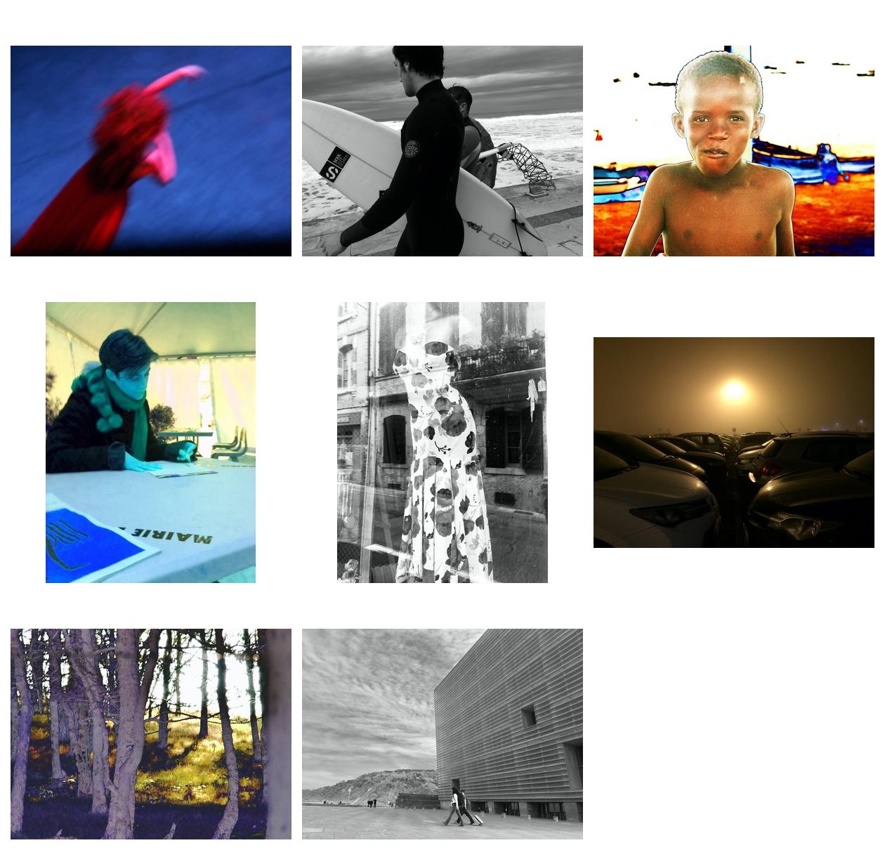
I went back to some of my images, and indeed I have often used false colors or striking ones like in this first picture of dance, with the contrasting red and blue. Obviously, contrast is a way to get highly structured pictures in b&w photography, like in the surfers‘ one with that heavy black suit in the front and middle of the picture. But I achieved a detached effect of the young boy in color with depth of field and the contrast between the rough colors behind and the unity of his skin.
The "sang bleu" (blue blood) picture (which is a french joke about noble people’s blood, as I took this picture during a "give your blood" session) is probably mostly a b&w type photography. Well I do love the blue atmosphere and the blue square in the front, but it is not a colorful picture indeed, yet a highly structured one. Is it what they meant when telling me I did "b&w photography in color" ?
On the other hand, I really felt like having the "flowery dress" in b&w rather than in color because it seemed to me to be more striking with the reflection of the street and the black windows behind. And can’t you see the colors of the flowers ? I remember Ansel Adams saying he achieved a far greater sense of color in black and white ! Well, I’m not sure I agree, but I do not miss the colours of these flowers.
The "car park" is probably another "almost b&w" picture. But in this one I do like the yellow sun like halo of light and I would certainly not have changed it to black and white even though its structure would have fit well. The "sous-bois"‘ is false colors. Perhaps it is not so important and could have it in b&w : the main topic is the flow of light in the opening in the distance, with the silhouettes of the trees. But I like the pale purple of the trunks in the front and the yellow-green of the grass and moss under the trees.
The last picture, the museum at sea front in San Sebastian, Spain, which I have named "passers by" is really a mere b&w picture for me. You can imagine the blue sky, ok, but I do not think it would get more interest. On the contrary colors would probably get this picture less striking with the contrasts between the building lines and the mustard sky and the people walking in the middle.
I let you appreciate these differences between b&w and color photography through these few examples and refer to your own practice. Let’s think (and talk) about it !
Philippe
Moments in black and white
Pognana Lario – The Secrets of Lake Como
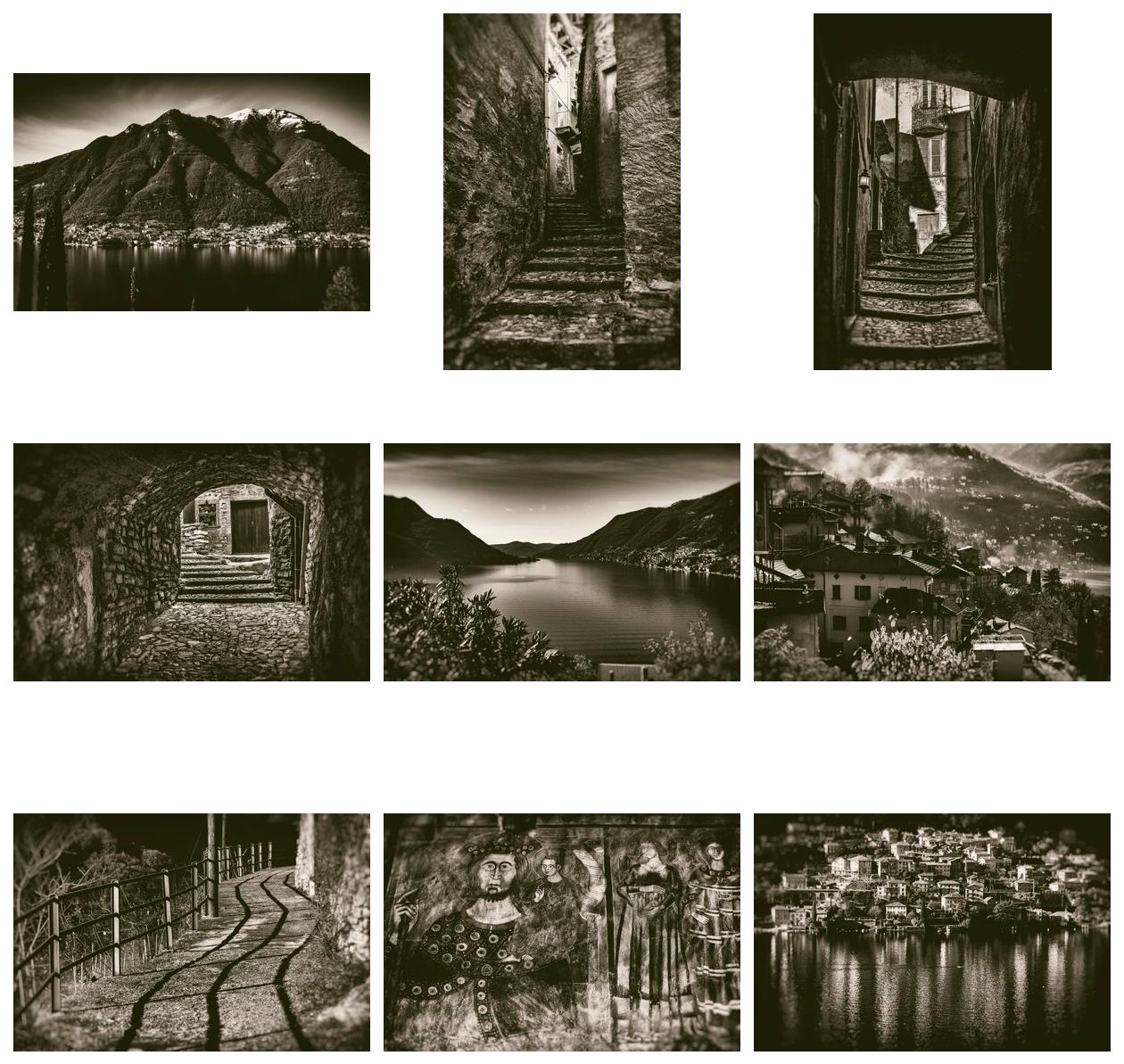
There is a wonderful place, perched on the mountains above Lake Como. A necklace of villages, connected by ancient roads and paths, made of stone and wood, with and incredible scenario in front of them. Here, lake and mountains come together in an unique experience, made of an historic, rural charm, and the grandeur of the immense scenario of the lake basin.
Walking the ancient stone paths between villages, the same “Via Regia” crossed by Pope Urbano II in 1095, is an astonishing experience. The view on the lake, in the clear winter light, is a pure joy for the eyes, and entering the narrow street of the villages, with their medieval passages under the houses, or stopping near the stone churches with ancient paintings, it’s reconnecting with our past and history with a single, intimate line.
Here the nature benefits from the lake influence on climate, with olive trees, flowers, and green meadows even in the middle of winter. The smell of grass, wood, smoke and moss are mixed in the air, and the silence recall ancient times when the Lake Como was a place of passage, legends and mystery.
